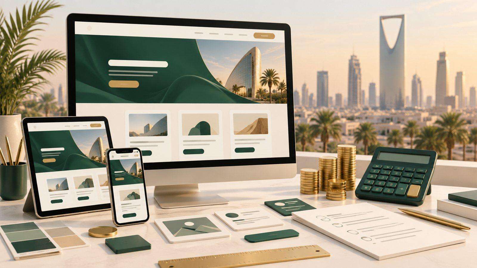
A responsive website adjusts its layout to the screen it is viewed on, so the same page works on a phone, a tablet and a desktop. For most businesses it is the baseline for a modern site. Here are ten practical reasons it is worth the investment.
Top 10 Benefits of Responsive Web Design
1. Most Visitors Are on Phones
People search, compare and message businesses from their phones. If your pages are hard to read or tap on a small screen, many of those visitors leave before they see what you offer.
2. Better User Experience
On a responsive site, text is readable without zooming, buttons are large enough to tap and menus fit the screen. Visitors find what they need faster, and that is what turns a visit into an enquiry.
3. One Website Instead of Two
Separate desktop and mobile sites mean two designs to build and two sets of pages to update. One responsive site costs less to build and much less to maintain.
4. Stronger SEO
Google mainly uses the mobile version of a page to index and rank it. A site that works well on phones gives your content the best chance of ranking, and one address per page keeps links and shares pointing to the same place.
5. Easier Management
With a single site, your team updates a price, a service or a phone number once. There is no second version to forget, and analytics show all visitors in one report.
6. Links That Work When Shared
Links shared on WhatsApp, Instagram or LinkedIn are usually opened on a phone. A responsive page looks right however the visitor arrives, so a shared link is never a dead end.
7. Ready for New Screen Sizes
New phones, foldables and large monitors keep changing screen sizes. A responsive layout adapts to the space available, so you do not need a redesign each time a new device becomes popular.
8. Faster Pages
Good responsive design sends smaller images to smaller screens and loads only what each device needs. Faster pages keep visitors on the site and help with search rankings.
9. Local and Mobile Searches
Searches such as “near me” or a service plus a city name are mostly made on phones, often by people ready to call or visit. A mobile-friendly page with a tap-to-call number and a map link makes that next step easy.
10. Non-Responsive Websites Look Out of Date
Visitors judge a business by its website. A page that needs pinching and zooming suggests the business has not been updated either, and a competitor is one tap away.
Conclusion
Responsive design is not an extra feature. It is how a website reaches the people who are looking for you, on the device they are actually holding. If your current site was built for desktop only, a responsive rebuild is usually the most useful single upgrade you can make.
Need a responsive, bilingual website?
Our team designs mobile-first websites in Arabic and English. Learn about our website development services, progressive web apps and UI/UX design.